
Marilyn Diptych by Andy Warhol
Marilyn Diptych by Andy Warhol
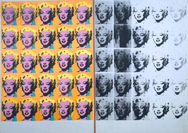
The seminal piece by the self-acknowledged pop artist, Andy Warhol. The Diptych is a mash-up of religious iconography and consumer culture.
A diptych was a two-paneled painting in the Middle Ages often depicting images of the Madonna. Warhol decided to use format in order to apply a similar message - with a cynical twist equating religious icons to Hollywood ones - to the recently deceased Marilyn Monroe.
The work is generally perceived to be a critique of our focus on excessive consumerism and idol worship at the time it was created in 1962. Luckily, we've long since overcome such societal ills [single cough in the background at this dubious observation].
Where do I focus my gaze?
The Marilyn Diptych is an example of an allover composition. Traditional artwork forces the viewer to focus their gaze on a particular key spot (or spots) in the piece. The Marilyn Diptych, however, has no central point to gaze at, consistent with its themes relating to our obsession with mass consumption.
The left panel signifies the rise and fall of Marilyn Monroe's popularity while she was alive. The right panel, which lacks the vibrant color of the left, shows the decay of her memory in popular culture after her death.
The intimacy of mass-production
Warhol used screen-printing to color the individual images of Marilyn on the left panel of the diptych.
Typically, screen-printing allowed for mass reproduction of an original design. By employing this technique, Warhol was taunting Hollywood's manufactured intimacy surrounding its stars and the false bonds that fans generated with those stars' images.
However, he also made subtle adjustments to each image, thus ensuring none of them were identical. In doing so, he was showing the subtle decay and skew associated with this manufactured intimacy and how all that glitters is not on the Hollywood Walk of Fame.